Living & Dying ≪ ≫
2010
Varied edition of lithographs, each 23” x 17 ½”
38 from set of 50 shown framed and on tables, under plexiglas
Documentation of exhibition at YYZ, Toronto
Varied edition of lithographs, each 23” x 17 ½”
38 from set of 50 shown framed and on tables, under plexiglas
Documentation of exhibition at YYZ, Toronto
A Matter of L and D
Barbara Balfour
Text published in YYZ Unlimited publication, 2010
life and death
My first inclination is to say something humourous, to deflect attention from the thing itself. I don’t want you to think it’s a matter of life and death, to use an overused expression, because it isn’t. Or if it does relate to life and death, then it’s about the space in which living and dying are so close as to be almost indistinguishable.
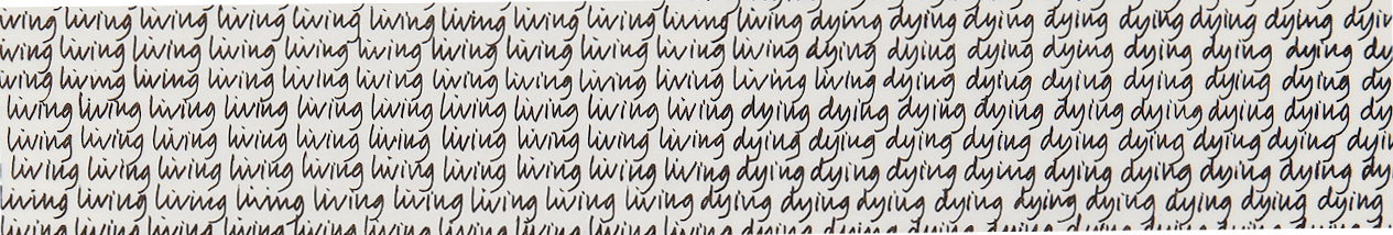
living living living iving living living living living living living dying dying dying dying dying dying dying dying
In my handwritten text, each line is a concatenation of “living living living” which, at a certain point, changes to “dying dying dying.” Yet this point is uncertain, varying from line to line, from top to bottom, causing a fluctuation between living, on the one hand, and dying, on the other.
this and that
There is enough of a difference threshold between the handwritten letterforms of “living” and those of “dying” to produce two distinct word masses. But at what point does living become dying? From what vantage point can you best detect this? When does this become that?
nearly the same
I’ve printed and reprinted to produce a varied edition of texts that are nearly the same. They’re reiterations differing slightly in each instance; they say almost the same thing, although the introduction of colour changes everything.
horizontal, vertical
From one handwritten text, black ink on white paper, I’ve printed various coloured iterations revealing different portions of the entire text, itself larger than the prints. As a result, there are varying proportional relationships between the sides of “living” and “dying.” Responding to the insistent horizontality of the rows of writing, to the text that seems to repeat itself (relentlessly, soothingly, absurdly?), I incorporated the vertical counterpoint of oscillating bands of coloured ink. I’ve come to think of the text as a script that changes with the inflection of colour.
reading the script
I wanted the aspect of colour to confound the reading – to work against the literal nature of the words themselves and to expand their possible meanings. At the same time, in order to read the text and make the necessary leap to what the words might signify, one cannot dwell too much on the visual presence of the letterforms or the colours of ink in which they have been printed.
shift
On any given day of printing, I would make a set of colour variations derived from a configuration of hues and tones that I altered, from print to print, through physical blending or the addition of colour. Within and across the colour sets, relationships are subtle at times and extreme at others. They blur, intensify, and fade.
in the end
To say that the sets of colours are meaningful to me won’t help any viewers. My choices are too subjective and personal to warrant being identified and explained; there is a lot that I’ve left unsaid. The profusion of variations might be one way of saying that I don’t have one way of saying what living and dying are.
Barbara Balfour
Text published in YYZ Unlimited publication, 2010
life and death
My first inclination is to say something humourous, to deflect attention from the thing itself. I don’t want you to think it’s a matter of life and death, to use an overused expression, because it isn’t. Or if it does relate to life and death, then it’s about the space in which living and dying are so close as to be almost indistinguishable.
living living living iving living living living living living living dying dying dying dying dying dying dying dying
In my handwritten text, each line is a concatenation of “living living living” which, at a certain point, changes to “dying dying dying.” Yet this point is uncertain, varying from line to line, from top to bottom, causing a fluctuation between living, on the one hand, and dying, on the other.
this and that
There is enough of a difference threshold between the handwritten letterforms of “living” and those of “dying” to produce two distinct word masses. But at what point does living become dying? From what vantage point can you best detect this? When does this become that?
nearly the same
I’ve printed and reprinted to produce a varied edition of texts that are nearly the same. They’re reiterations differing slightly in each instance; they say almost the same thing, although the introduction of colour changes everything.
horizontal, vertical
From one handwritten text, black ink on white paper, I’ve printed various coloured iterations revealing different portions of the entire text, itself larger than the prints. As a result, there are varying proportional relationships between the sides of “living” and “dying.” Responding to the insistent horizontality of the rows of writing, to the text that seems to repeat itself (relentlessly, soothingly, absurdly?), I incorporated the vertical counterpoint of oscillating bands of coloured ink. I’ve come to think of the text as a script that changes with the inflection of colour.
reading the script
I wanted the aspect of colour to confound the reading – to work against the literal nature of the words themselves and to expand their possible meanings. At the same time, in order to read the text and make the necessary leap to what the words might signify, one cannot dwell too much on the visual presence of the letterforms or the colours of ink in which they have been printed.
shift
On any given day of printing, I would make a set of colour variations derived from a configuration of hues and tones that I altered, from print to print, through physical blending or the addition of colour. Within and across the colour sets, relationships are subtle at times and extreme at others. They blur, intensify, and fade.
in the end
To say that the sets of colours are meaningful to me won’t help any viewers. My choices are too subjective and personal to warrant being identified and explained; there is a lot that I’ve left unsaid. The profusion of variations might be one way of saying that I don’t have one way of saying what living and dying are.